

Basic business Process
Sales receives customer proof request > Sales sends proof request to Artist > Artist creates vector artwork and rendered proof > Artist sends proof to Sales for review > Sales sends proof to customer > If approved, Artist sends vector artwork to production.
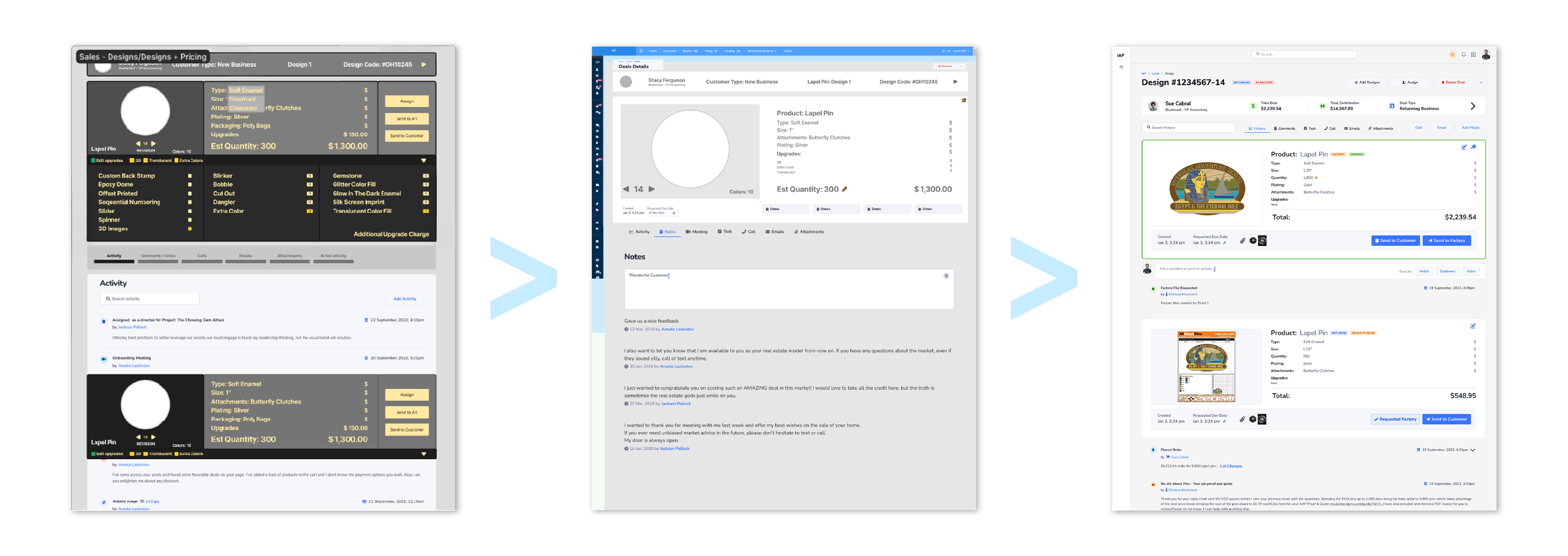
Internal proof request page
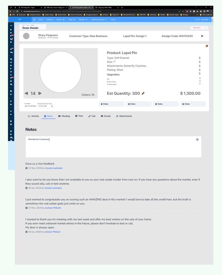
Previous Sales Interface
•Too much information present
•Unnecessary and duplicate information
•No information hierarchy
•Ineffective color use
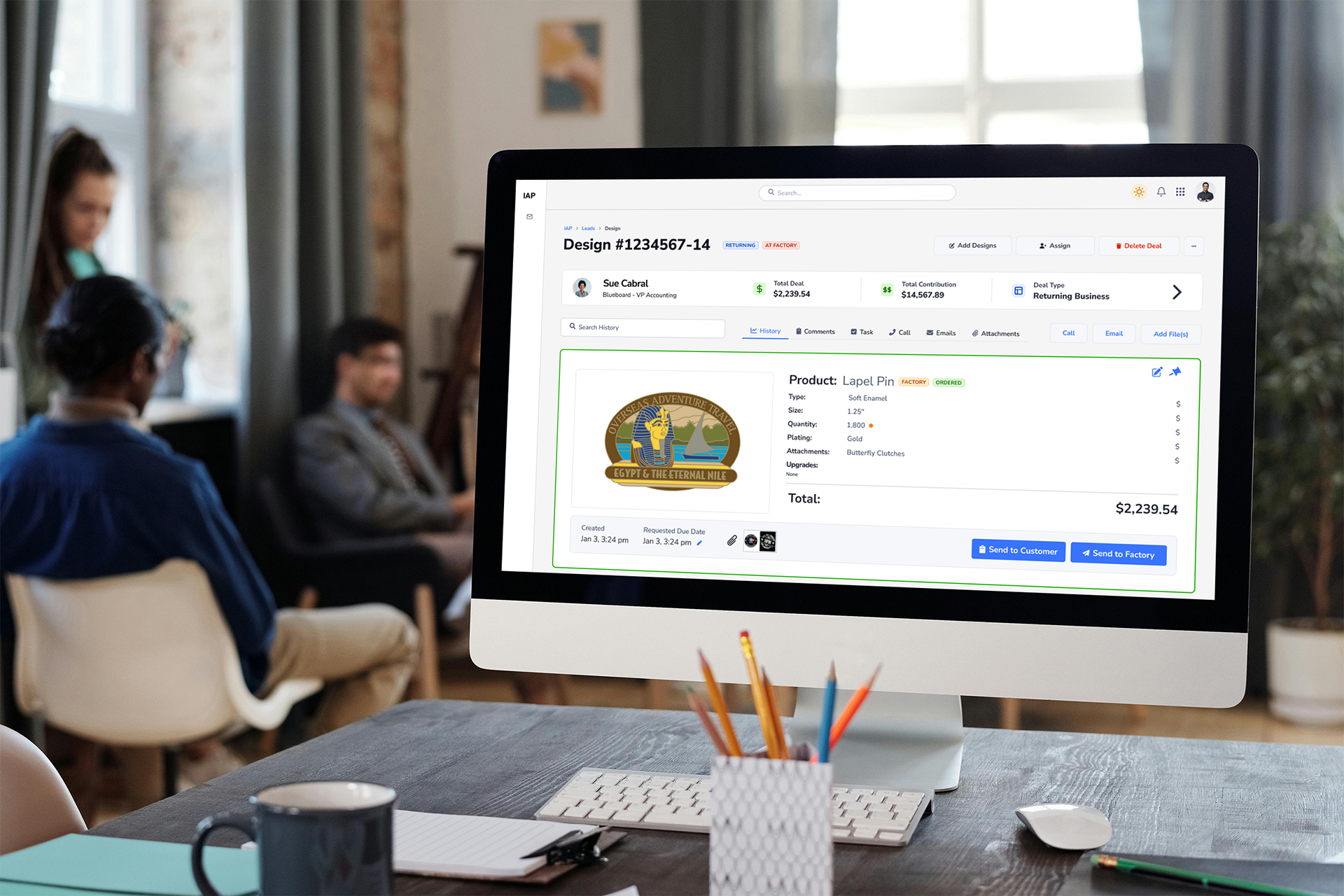
New Sales Interface

Simplified | Unnecessary information removed | Information Hierarchy | Intentional Color Use
Explained in 4 parts:

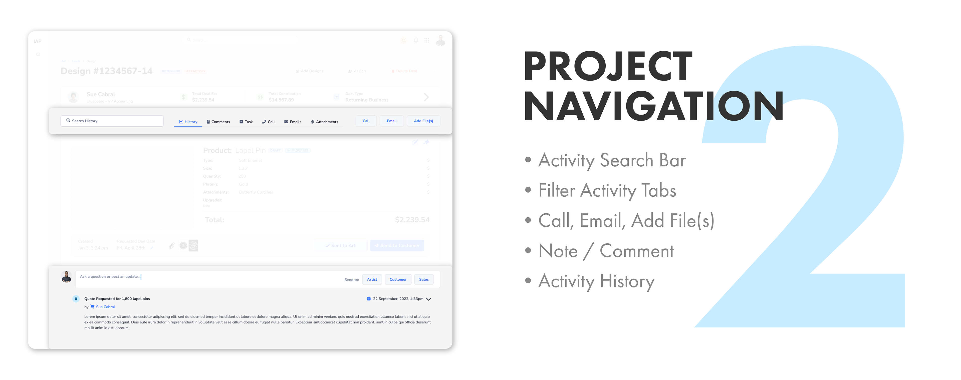
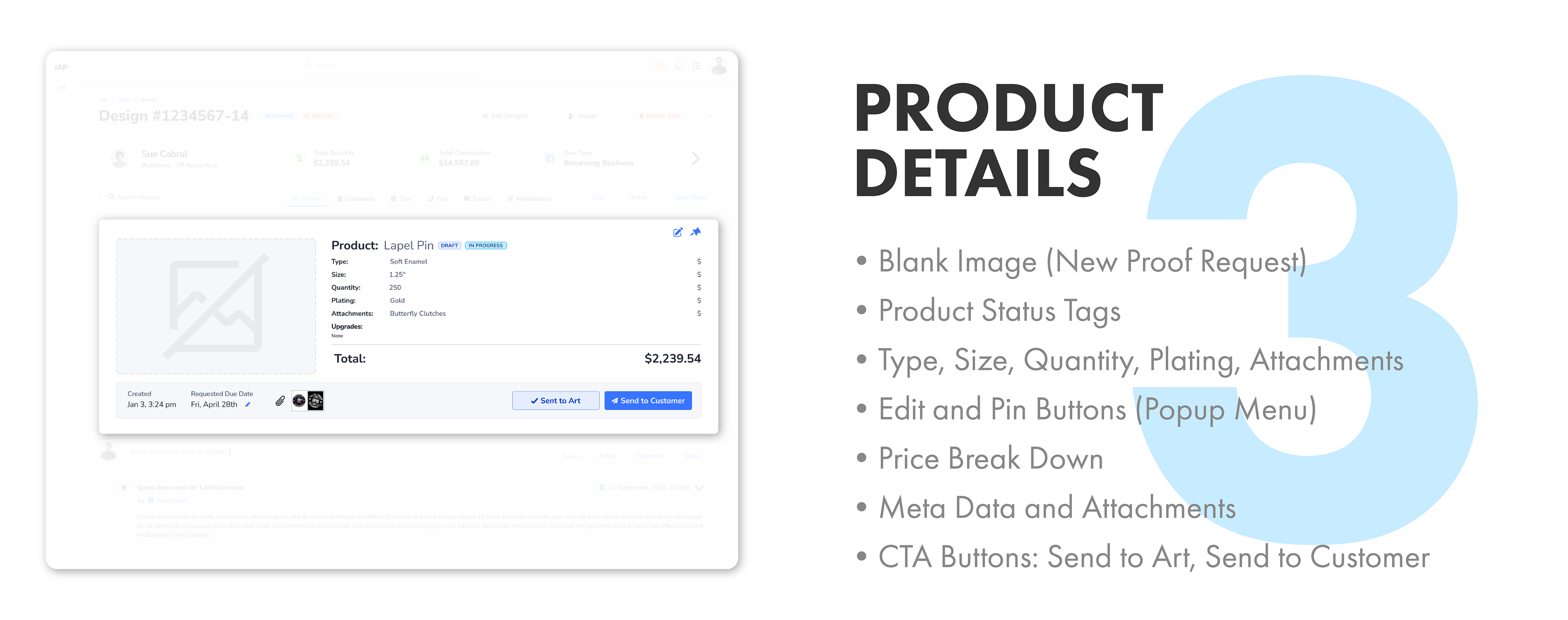
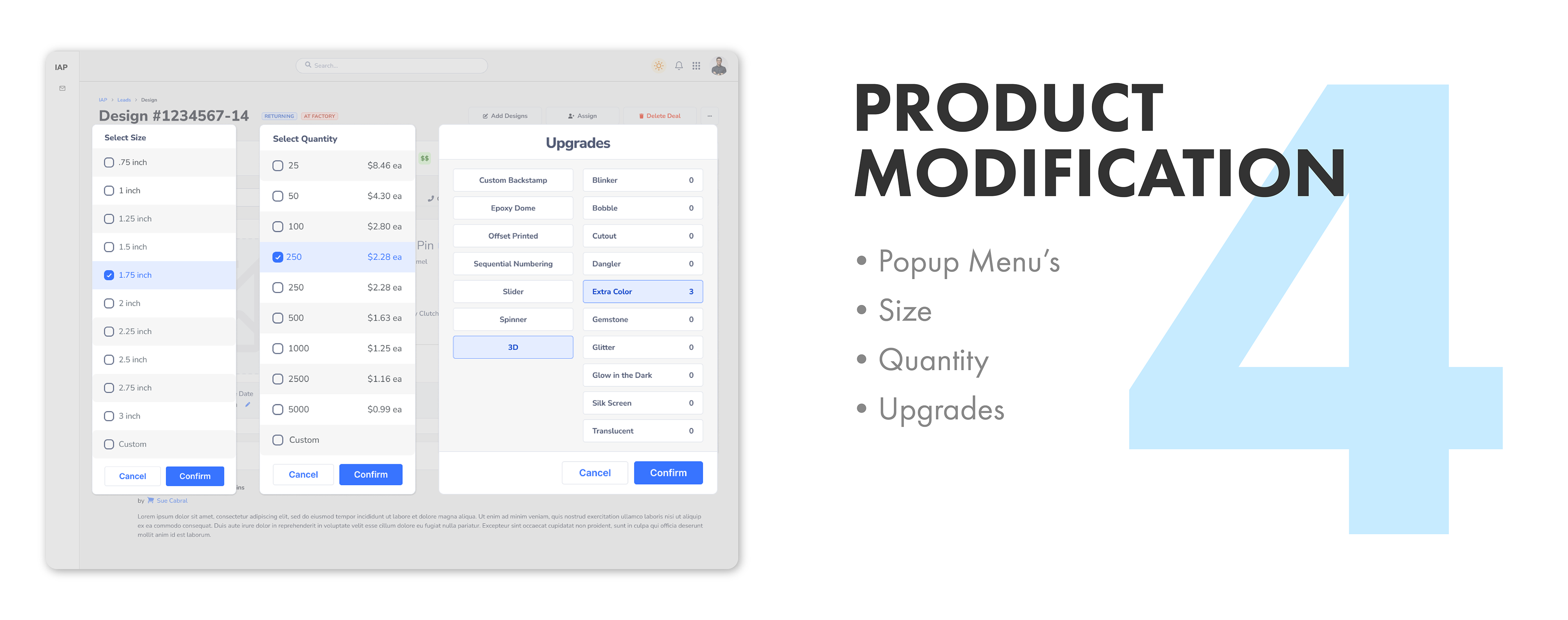
Sales interface with history
Scrollable monitor below
I created 4 versions in total. Sales with and without history, and Artist with and without history.
Artist proof request page
Previous
Artist Interface
Artist Interface
•Same issues as on the Sales end
•Needs even less information
•Needs even less information
New Artist Interface

•Primary Header action buttons removed
•Customer panel extension removed
•Project Navigation bar removed
•Product Details price breakdown removed
•Timer with "Pause" and "Finish" buttons replace "Send" buttons
•Customer panel extension removed
•Project Navigation bar removed
•Product Details price breakdown removed
•Timer with "Pause" and "Finish" buttons replace "Send" buttons
Artists are presented with less information to manage. Their roll predominantly has them working in Illustrator and Photoshop. Sales manage the ins and outs of the customer interactions. They are the heavier users of this internal program, so they have more tools at their disposal.
Artist Interface with History
Scrollable monitor below
PROCESS
Discovery & Ideation
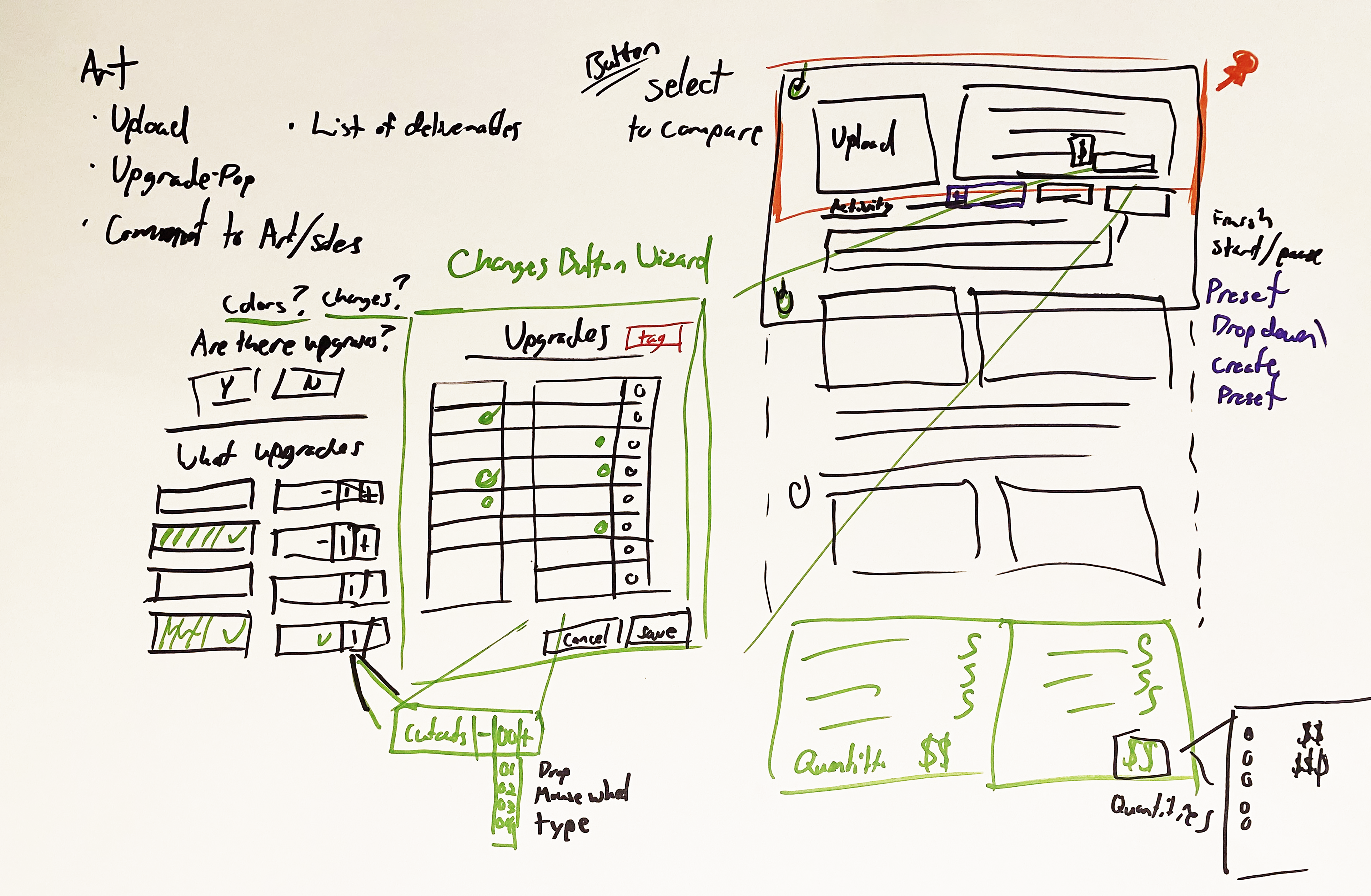
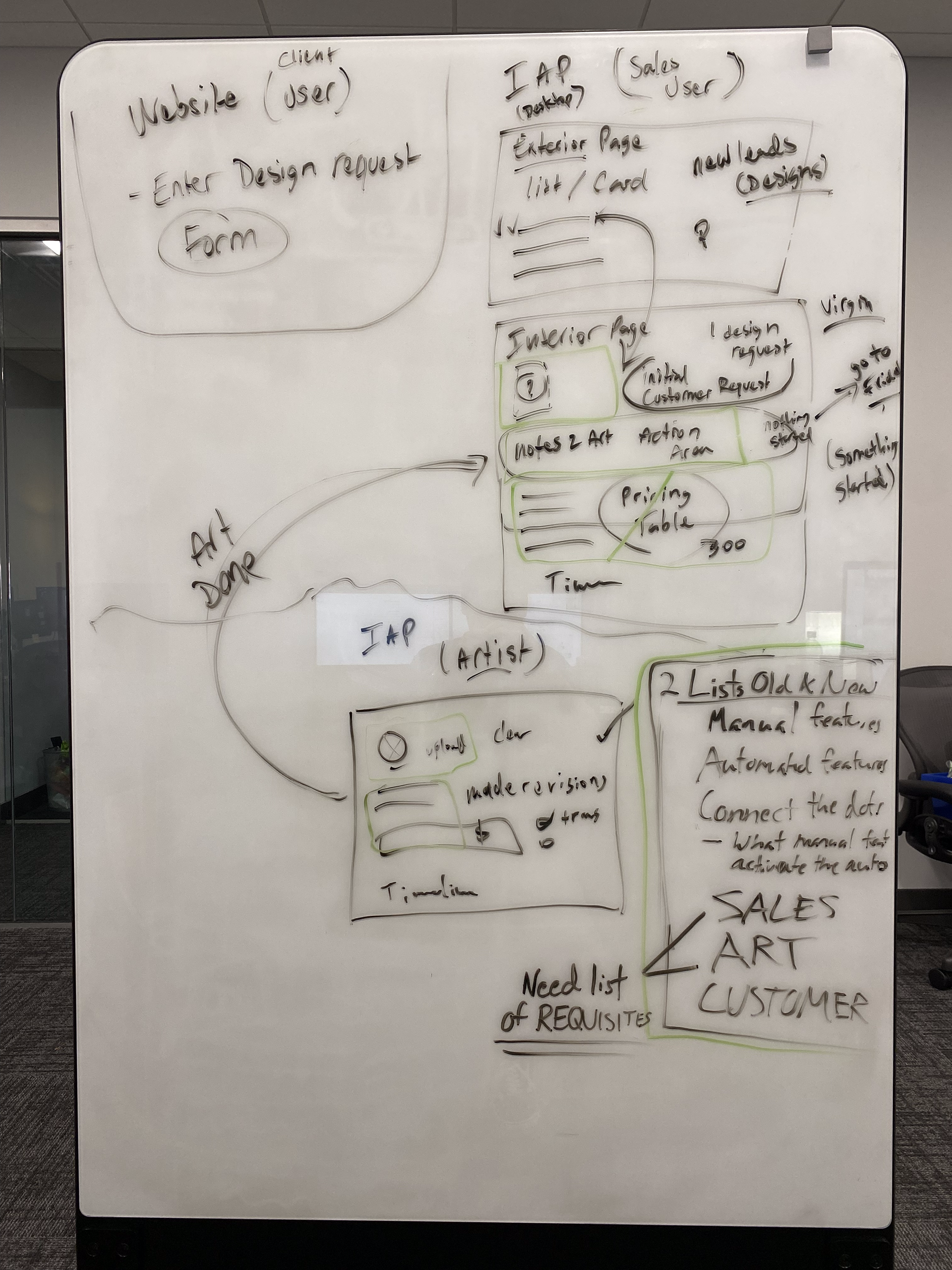
•Began with whiteboards and sketchbooks to explore layout and structure
•Collaborated with the Marketing Director and CEO to define goals and needs
•Audited the current interface to identify usability issues and bottlenecks
•Interviewed sales team members to understand their pain points and workflows
•Conducted interface and industry research to explore best practices
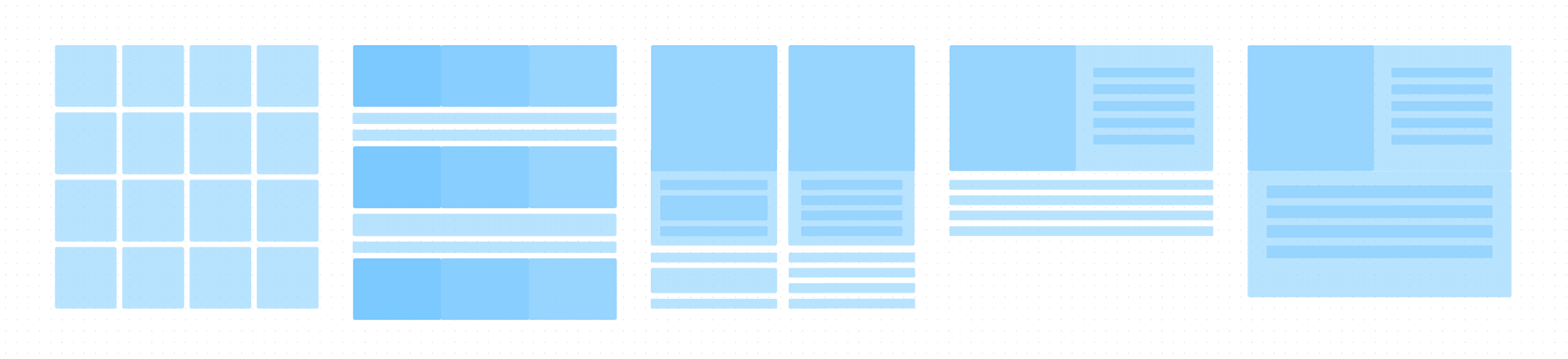
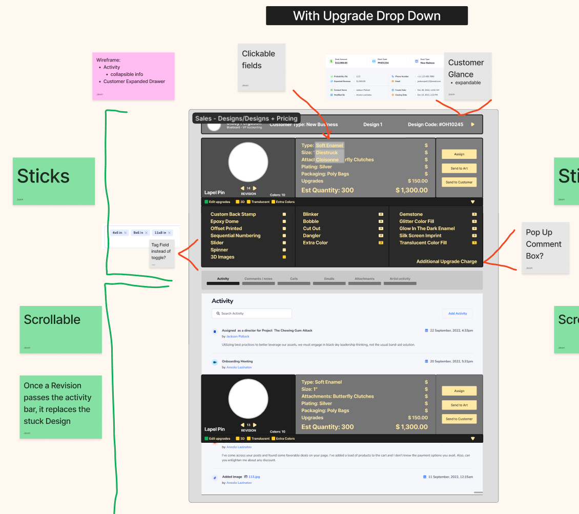
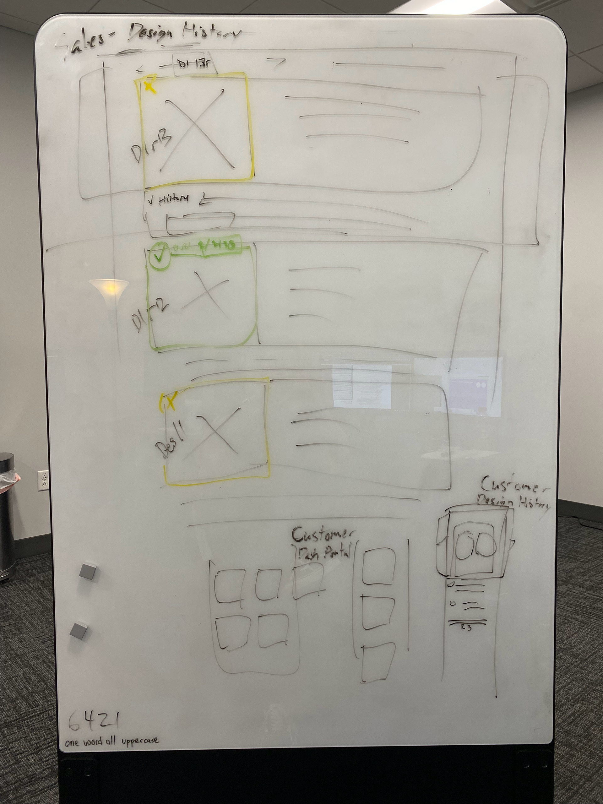
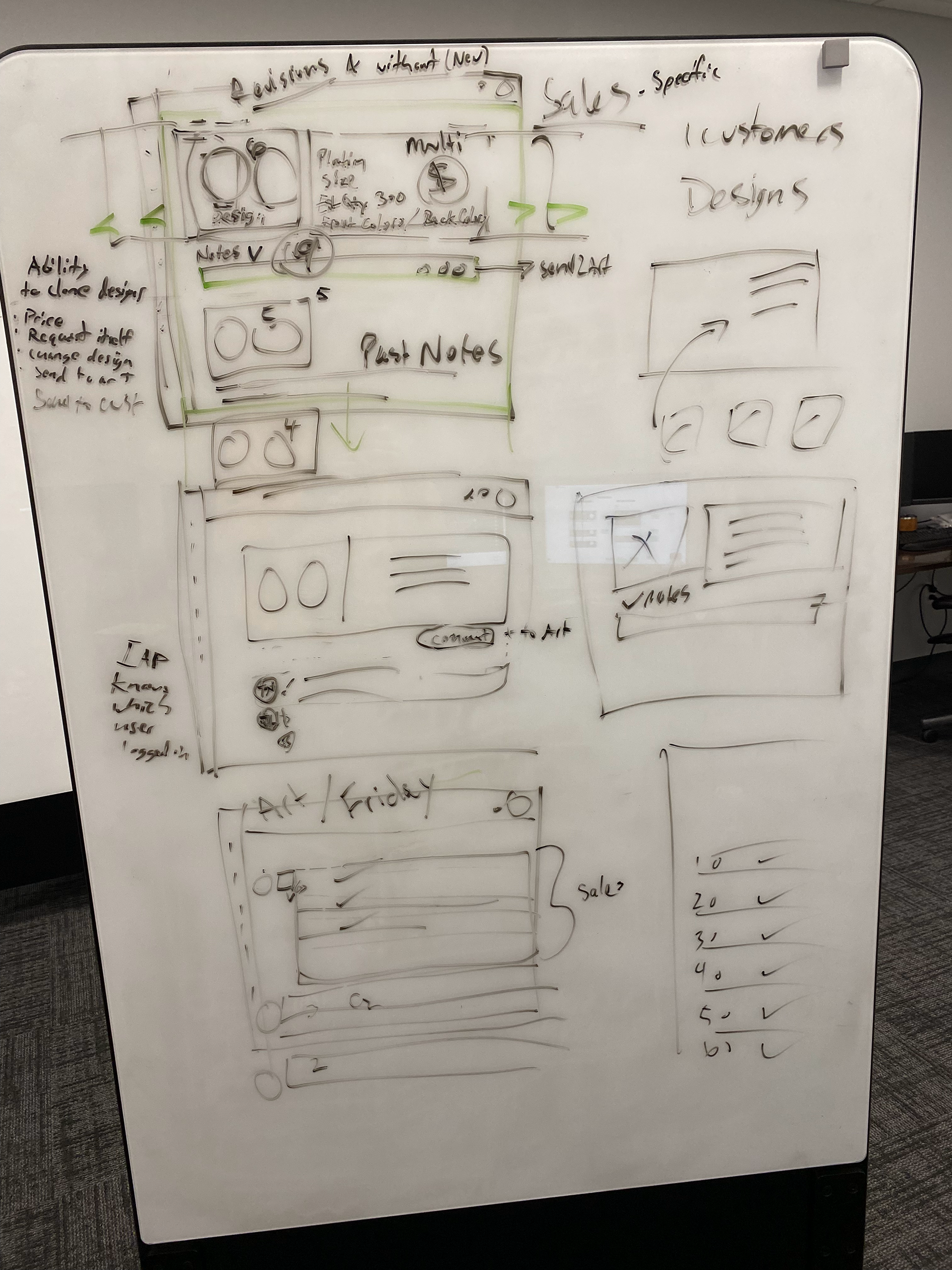
Low-Fidelity Wireframing

Concept Development
•Created early concepts and layout ideas
•Built low-fidelity wireframes to explore structure and flow
•Presented early drafts to stakeholders for input and validation
•Iterated based on feedback from both leadership and end users
Refinement & Visual Design
•Applied visual hierarchy and simplified the layout for faster scanning
•Utilized a UI Library for consistent design language across components
•Focused on improving usability without overcomplicating the interface
•Prototyped flows to show how tasks could be completed more efficiently

Conclusion
I reimagined a cleaner, more intuitive user experience tailored to how my colleagues used the system. By listening to pain points, simplifying workflows, and refining the interface, I created a foundation for better day-to-day efficiency. In the end, the redesign helped people get their work done faster with fewer obstacles.